by tm design, inc.
 
 
IT'S ALL ABOUT THE FONT... OR IS IT?
How Typography Bridged The Gap Between Technology and Nature
 
ITIKI Logo
 
Typography isn’t just about selecting fonts and calling it a day. It’s how you use them – sometimes down to making the very shape of the type work for you. Today is Typography Day so let’s give a shout out to one of our favorite logotype creations.

ITIKI, an acronym for Information Technology and Indigenous Knowledge with Intelligence, is a bridge that integrates indigenous and scientific drought forecasting approaches using technology. We designed a type-based logo to represent the organization, a common but effective style that takes the skills of a designer to mold something unique for the client.

Shapes were formed in and between the letters to show the aspects of this product – weather, technology, crops, and nature. Our aim was to include the multiple messages ITIKI wanted to convey without sacrificing the integrity of a clean and direct presentation. By taking something away from the type (knocking out the shapes), we added a special uniqueness to the brand to make it stand out from the rest.

We guess you could say we were picky with ITIKI.

 
What can we design for you? >>
 
 
“The logo captures the spirit of everything we were seeking to accomplish. The color palette is so welcoming and calming, and helps to incorporate many elements of the ITIKI business inspiration/story and how it operates using technology and indigenous knowledge for agriculture.”


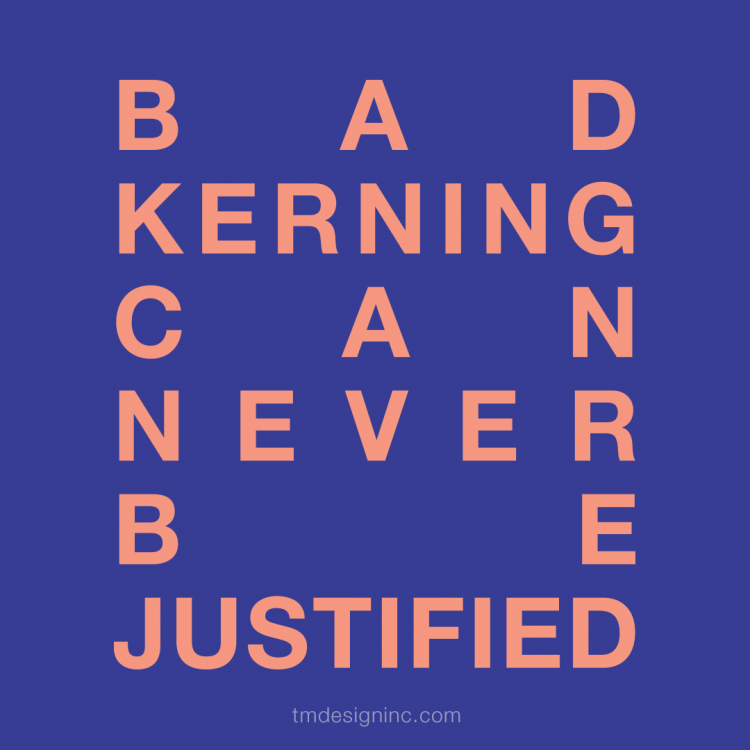
KERNING, LEADING & TRACKING
'Cause Our Type is Neat & Tidy
 
Bad Kerning Can Never Be Justified
 
Nerd alert! We're about to get into the weeds a bit on typography. But we love this stuff and that's the kind of people we are. So. This is all about the spacing between letters in your design layouts. Many fonts need to be adjusted with kerning, leading and tracking to be more readable.

Leading: This is the spacing between baselines of type. It comes from the ol' days when lead strips were used between lines of type on hand-set printing presses. Adjusting leading is a way to save or use other space on a page.
 
Kerning: The spacing between individual type characters is kerning. Most fonts already have kerning, and changes can be very subtle. But kerning can save space in a layout, help you to not have to awkwardly break words, and neaten up lines or blurbs of type while looking natural.
 
Tracking: This is the term for spacing between groups of letters, not individual letters, like kerning. It affects the density of your copy, helping it become more readable, and making lines of type even. Like kerning, it's also another tool to eliminate widows and orphans in paragraphs.

These are not always necessary and the untrained eye might not even notice them, but they are all three important finishing touches on your type and layout. That’s why you hire us. 

 
Follow us for a weekly dose of design jargon, fun facts, and more!
  • facebook
  •  
  • instagram
 
 
Design is our thing. Let us help you with yours. logomark Give us a buzz.
301-831-1114 | [email protected] | tmdesigninc.com
  • LinkedIn
  • Facebook
  • Instagram
  • Pinterest
 
 
© 2018 TM Design, Inc. | TM Design, Inc. is a certified Minority Business Enterprise.
5807 Underwood Court, Adamstown, MD 21710 | Unsubscribe | Subscribe